
Guide to Choosing the Right Correlated Colour Temperature (CCT) for Every Room
If CRI is about how accurately light shows colour, CCT is about the mood, feel, and atmosphere that the light creates in a space. Choosing the right CCT for each room is one of the simplest and highest-impact decisions you can make for your home, and yet it is something most people never consciously think about. They accept whatever light came with the property, pick whatever was on the shelf at the hardware shop, or simply assume that all LED light is more or less the same. It is not. The difference between the right CCT and the wrong one in a given room is something that everyone in that space feels immediately, even when they cannot explain precisely why.
What CCT Actually Means

CCT stands for Correlated Colour Temperature. It describes whether a light source produces warm, cool, or neutral light, measured in Kelvin. The Kelvin scale, in the context of lighting, runs from very warm amber-toned light at the low end to very cool blue-white light at the high end. This correlation between Kelvin value and the perceived quality of the light is consistent and reliable across different light sources and technologies.
Lower Kelvin values produce warmer, more amber-toned light. Higher Kelvin values produce cooler, more blue-white light. A few familiar reference points help anchor the scale. Candlelight sits around 1800K, a very warm and golden quality that is the warmest light most people encounter in daily life. Standard warm white LED fittings designed for comfortable residential use typically fall in the 2700K to 3000K range, warm and welcoming without the intense amber saturation of candlelight. Neutral white at 3500K to 4000K produces clean, balanced light that closely resembles the quality of natural overcast daylight, clear and accurate without a strong warm or cool bias. Cool white at 4000K to 5000K takes on the character of bright daylight, energising and clear. Daylight-spectrum fittings above 5000K approach the blue-white quality of direct midday sunlight and are used where maximum visual clarity is required.
The Emotional Effect of Different Colour Temperatures
Warm light creates comfort, ease, and a sense of belonging. It is what makes a restaurant feel welcoming rather than institutional, what makes a hotel bedroom feel genuinely relaxing rather than merely functional, and what makes a living room feel like a place you want to spend time rather than simply pass through. This response is partly aesthetic and partly biological. Warm light resembles firelight and the light of sunset, environmental conditions that have historically signalled safety, warmth, and the natural end of the active day. The nervous system responds to warm light with a gradual relaxation of alertness that is entirely appropriate in spaces designed for rest and connection.
Cool light creates alertness, clarity, and focus. It resembles the quality of daylight at its most intense, the kind of light that tells the body and brain it is time to be engaged, productive, and attentive. Used in the right context, cool light is a genuine performance enhancer. Used in the wrong context, in a space where you are trying to rest or unwind, it creates a friction between what the space is designed for and what the light is signalling to your body. That friction is rarely identified consciously, but it contributes significantly to the feeling that a room never quite feels the way it should.
Matching CCT to Each Room in Your Home
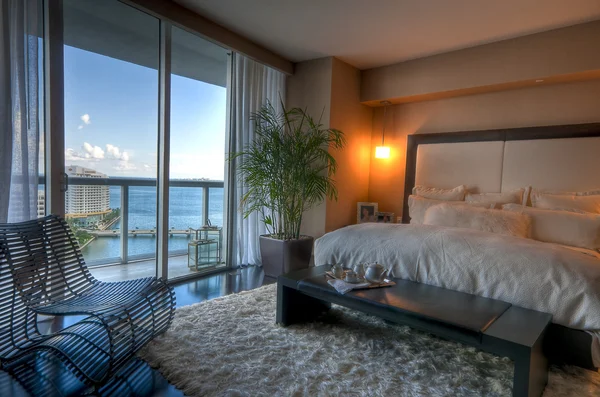
Bedrooms should use warm white in the 2700K to 3000K range. This is a space whose primary purpose is rest and recovery. Warm light supports the body's natural wind-down process by avoiding the melatonin suppression that blue-white light causes. It creates an atmosphere that feels genuinely comfortable and inviting, making the bedroom feel like a sanctuary rather than just another room in the house. Even when the bedroom doubles as a reading space, warm white at the right lumen output is perfectly adequate for reading without the sleep-disrupting effects of cooler light.
Living rooms benefit from the same warm white range for the same fundamental reasons. This is where the household relaxes, socialises, watches television, and inhabits the home in its most natural way. The atmosphere should be warm and comfortable, not energising or clinical. If your living room also serves as a daytime workspace, a separate and independently controlled task light with a slightly cooler colour temperature provides the focus support needed without making the entire room feel like an office.
Dining rooms, particularly for evening use, are another natural home for warm white lighting at 2700K to 3000K. Warm light makes food look more appetising by enhancing the natural colours of cooked food, particularly the warm tones in proteins, pastry, and grains. It makes skin tones more flattering, which makes the experience of sharing a meal more genuinely enjoyable. It creates an atmosphere that encourages people to slow down, linger at the table, and connect, which is exactly what a well-designed dining space should achieve.
Kitchens benefit from neutral to slightly cool light in the 4000K to 5000K range. When you are handling sharp utensils, judging whether food is properly cooked, and working at a level of precision that food preparation requires, cooler light improves your ability to see food colours accurately. It supports the focused and attentive state that cooking safely and well requires. The trade-off in atmosphere is entirely appropriate because the kitchen is first and foremost a workspace.
Bathrooms sit comfortably in the 3500K to 4000K range. This neutral territory is warm enough not to feel harsh or clinical, while being neutral enough to show your skin tone, makeup, and clothing colours accurately before you head out into natural daylight. Pure warm white in the bathroom tends to make skin tones look unnaturally rosy or golden, creating a flattering but inaccurate view that does not translate to the outside world. Neutral white gives you a clearer and more honest picture.
Home offices and study areas work best with neutral to cool light in the 4000K to 5000K range. You are in this space to focus, think clearly, and produce quality work. Warm light in a workspace creates a relaxed feeling that actively works against sustained concentration. Cooler light keeps you alert, makes reading and screen work easier on the eyes, and supports the kind of prolonged attention that productive working genuinely requires.
Keeping Colour Temperature Consistent Within Each Space
Within any single space, colour temperature should be consistent across all light sources. Mixing a warm white pendant with cool white downlights in the same room creates a visual conflict that makes the space feel unresolved and subtly uncomfortable. The eye perceives the different light qualities simultaneously and registers the inconsistency in a way that is difficult to attribute specifically but genuinely persistent.
Different rooms can and should have different CCT values. That is the entire point of matching colour temperature to the purpose of each space. But each individual room should feel unified in its light quality. The most common and acceptable exception is a task light within a room that has a primarily warm ambient setting, such as a desk lamp with a slightly cooler temperature in a warm living room. This differentiation reads as intentional rather than inconsistent because the task source is clearly serving a distinct purpose.
CCT is a decision made at the point of purchase because most LED fittings are manufactured with a fixed colour temperature. Some modern fittings offer tunable CCT, allowing you to adjust the Kelvin value through a dimmer or app control, which is a genuinely useful feature for multipurpose spaces. But for most rooms in most homes, knowing the right Kelvin before you buy is entirely sufficient. Get it right in each room, and your home will feel more considered, more comfortable, and more like itself. Often without any other changes at all.